Checkout Components No-code for Shopify Plus checkout
Stay up to date with the latest product changes for Checkout Components, a Shopify Plus app that allows you to customize your checkout experience without writing code.
Across all upsell components you can now power upsells in checkout via specifying product metafields that contain product references.
Post purchase
Post purchase is now available to all merchants on all plans. Show one-click upsells and downsells at a discount. Features such as display rulese, translations, recommendation sourcing that you are used to using on upsell components are also available on post-purchase.
UI / UX improvements
New component selection screenshot
New apperance modal
Carousel product cards
3 new layouts are available to upsell components of the carousel variant.
Simple: render the product image with title and price below
Glass: Render the simple product card with the title and price on top of the image.
Default: Render a larger product card with variant selector and add to cart button below
Buy now pay later
You can now have multiple BNPL providers in a single component
In time for BFCM25, Checkout Components has released over 25 updates. To learn more about some of the major updates, head to our website
Improvements
Performance improvements
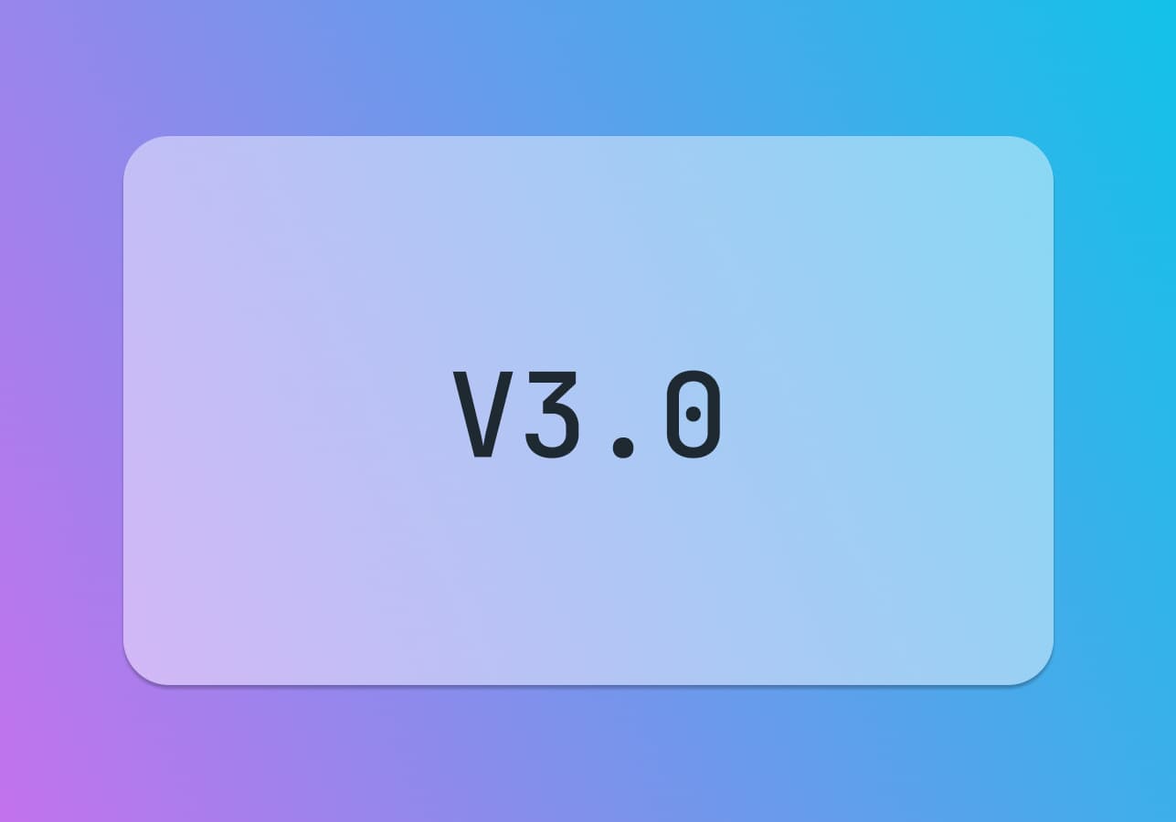
Components on v3.0 now render up to 100% faster due to a major architectural change.
Redundancey architecture
Checkout Components is now deployed to AWS and GCP, ensuring uptime whenever a major cloud service provider goes down... Looking at you AWS!
Advanced display rules
Combine multiple display rules with AND / OR logic to target more specific customer and cart segments.
Translations and Locales
You can now translate components at a field level to multiple languages.
Product mapping
Define known cross-sells and use them as a recommendation source on any upsell component.
Dynamic Line item highlights
Line item highlights can show dynamic content; such as percentage savings, compare at price, line item properties, product vendor and product type.
Hidden Products
Has been expanded so now merchants can hide products specifically, by tags, vendor or type in any upsell component.
Free shipping
Free shipping upsells can now be placed inside shipping methods
Connect your free shipping upsells to each currency associated within each Shopify market. No more duplicate free shipping upsell components.
Shopify AI recommendations
We now ask Shopify for recommendations on all line items.
Merchants can now choose to source recommendations from Shopify AI that are complementary or related.
Minor component updates
Review star color has been changed to accent.
Radio (Donation) upsells now support images to display the charity merchants are donating to.
Review components now support a new carousel Layout
A new setting has been added to upsell components which enables you to hide the component after a recommendation has been added to cart.
Upsell recommmendations now use the new product thumbnail from Shopify
Debug mode
Debug mode enables additional supporting UI rendering in the checkout editor, as well as exposes informative console logs in the browser for you to be able to share with the Checkout Components team.
New Integrations
Boost commerce
Okendo
Loox
Reviews.io
GBG (Goverment issued IDs. AUS only.)
Experiments
New Experiments system, which allows merchants to test new features and ideas before general availability
We're excited to share that Pro merchants can now display review stars and counts on their product recommendations in upsell components. This will assist further drive conversion of upsell recommendations by increasing trust and credibility to customers.
In adition to this, we have a new template and some changes to pricing.
Improvements
New upsell variant: Upsell Carousel
Product cards in checkout now use more appropriate sized variant drop down selectors
All extensions have been upgraded to the latest version of the Shopify API
Changes to free plans
We are making some changes to the free plan. These changes are designed to help us continue to provide a high-quality service to our merchants while also allowing us to invest in new features and improvements. Free merchants are able to use the app, but with some limitations. These changes are as follows:
Free plans can only create manual upsells with up to 3 products
We're extending the display rules functionality in the not so distant future. Before that, we wanted to deliver the new UI and experience to all merchants. Watch this space!
In adition to this, we have a new template and some changes to pricing.
Improvements
An "authority to leave" input template has been added to the app
We love working with our merchants. This is a great example of why.
Checkout Components now has an interactive analytics dashboard. This dashboard allows merchants to see how their components are performing across date ranges and specific days.
Currently, the dashboard shows the following data:
Revenue generated by upsell components
Average order value (AOV) lift on eligibile orders
Sum of orders with upsells via Checkout Components
Sum of upsells purchased via Checkout Components
In adition to this, we have made some quality of life updates and improvements, which you can find below.
Improvements
Home page has more functionality and is clearer 🎉
You can now set a maximum number of characters for input components
Pricing cards now show example merchants to help you choose the right plan
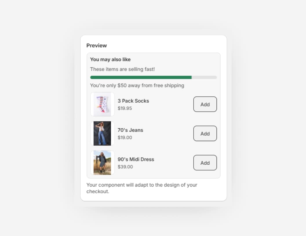
After many requests, component forms now have a preview of what the components will look like in your checkout.
Documentation will now start showing in context to what you are doing, upsell components get a major improvement and much much more!
In addition the following changes have been deployed in the past fortnight
Improvements
Platform:
Markdown components now supports bold and italic text
extension targets now are captured against purchased line items to inform future reporting
Upsell Components:
Algolia recommendation model is now managed at a component level
Searchspring recommendations now render product information in modals when product thumbnails are clicked
Mobile recommendation modals now support image galleries
Mobile product cards now render an updated user interface which has better support for longer product names
Admin
Forms: Component Previews 🎉
Documentation will now start showing in the admin UI 🤖
Checkout Components now has an official documentation website, which you can find at docs.checkoutcomponents.com. This documentation site is the home for all guides, tutorials and API documentation for the app.
Alongside this awesome new resource, we have made some quality of life updates and improvements, which you can find below.
Improvements
Platform: Markets rendering now supports up to 50 markets for conditional rendering
Upsell Components:
Modal UI have had a bit of a refresh, with more consistent modal sizes, product descriptions now visible on mobile and add to cart buttons are now sticky
Upsells no longer occasionally flash when loading or when products are added to cart
Free shipping components no longer required a color input, instead the color is now automatically set based on the checkout branding
Admin: Quality of life updates
Markets Publishing now correctly shows the new state of conditional rendering after update. No page reload required
Component list now has more icons to help identify the type of component
Conditional rendering form error handling has been improved
Components:
Shipping address conditional rendering now works as expected
Large upsells get an overhaul with a new UI. Large upsells will render more clearly, particularly with the border setting enabled. Alongside this improvement are further optimisations which can be found below.
Improvements
Admin: Billing page content is more clear
Admin: Free users will start to see some prompts around what they are missing out on
Bug fix: State codes now aren't case sensitive. As long as they are correct, we will pick up on the state code and render according to conditional rendering settings.
Upsell component:
New "Large" UI
Free shipping text can now be customised with templating language to insert remaining required spend for free shipping eligibility.
Probably the last update major before the end of the year, the team has been working hard on some improvements on the app for you all, specifically looking at modals and web accessibility. See foot notes below!
Improvements
Upsell: Improved product modals
New image gallery where the shown photo relates to the selected variant
Web accessibility standards have been improved
Cleared structure for better readability
Dynamic sizing based on product content
Upsell: Product images and buttons now support web accessibility standards
Upsell: Checkbox upsell now shows a success message when messages are edited after adding to cart.
Just in time for BFCM 2024, we shipped a new analytics system. This system will allow merchants to track the performance of their components in real-time. This is a huge step forward in the flexibility of the platform and will allow merchants to use data to power their upsell components.
Right now, the analytics system shows a revenue breakdown between all your upsell components over time, your top performing products and after many requests - we now show a holistic view of the revenue generated by all upsell components.
In addtion to the analytics system, we have made some quality of life updates and improvements, which you can find below.
Improvements
New analytics: Track revenue generated by upsell components over time
New analytics: Compare the performance of upsell components
New analytics: See the top performing products
Old legacy analytics system has been removed
Improved currency support for upsell components
Now when customers choose a different country in checkout, the upsell prices will update to reflect the new currency
Improved performance of upsell components
Removed component flashing on page load
Hide products button on upsell components has a more clear label
Shopify stores not using markets will now render components correctly - regardless of customer location
Checkbox upsells now allow customers to modify their gift note, even after adding the product to the cart
Date pickers can now support disabling a specific date or date range. This can be done inconjunction with the existing feature of disabling specific days of the week and buffering days.
Also in this release are some of quality of life updates and improvements, which you can find below.
Improvements
Date pickers now support disabling a specific date or date range
Conditional rendering is now available on customer "Shipping address" (Dynamic)
Upsell checkbox components customer optional messages save to order attributes as well as line item properties
Upsells now remove products from recommendations if they are already in the customers cart
Products selected in the admin for manual upsells no longer state "0 left in stock" on products that do not have their inventory tracked in Shopify.
In a single component, merchants can now conditionally render whether or not customers can edit line items mid checkout. Options currently available are to edit the quantity, remove the item, select a different product variant.
On top of this, merchants can also enable in checkout personalisation which is saved against the product as a line item property. Of course, alongside these awesome updates are general improvements which you can find below.
Improvements
New component type: Line item Edits & Upsells
All extension have been upgraded to Shopify API version 2024.04
Upsell components can now be integrated with Nosto. This is a huge step forward in the flexibility of the platform and will allow merchants to use Nosto to power their upsell components.
In addition, quality of life updates as well across the admin app and more.
Improvements
Content components now support mobile specific images
Feature requests can now be made via the admin
You can now conditionally render to specific states
Minimum spend now references the cart subtotal (exclusive of shipping)
You can now hide products from appearing in upsells
All non-deprecated Upsell Components now have clickable product thumbnail images. When clicked, a modal containing product details will be shown to the customer allowing them to see more information about the product before adding it to their cart in checkout.
In addition, quality of life updates as well across the admin app and more.
Improvements
Upsell Component modals
Checkbox upsell now support optional messages (subheadings on the product card)
Content Components of the Text variant now support markdown for adding inline links
Both Large Upsell and Checkbox Upsell variants can now optionally enable customers to leave notes associated with the upsell. This is great for upselling premium packaging or product customisation.
In addition, quality of life updates as well as Input Components: Radio options, being able to support adding a product to cart if the option is selected.
Improvements
Optional notes for Large Upsell and Checkbox Upsell variants.
Input Components: Radio options can now add a product to cart if the option is selected.
Upsell admin UI Improvements
Content components now are checkout aware (they show and hide based on more conditions)
Choose to hide products in upsells when using automatic & integration powered recommendations
Decide how many products should show per page in upsell components
A new upsell type that was built specifically for handling donations (or any product you think would look good in a radio group).
This upsell type is a radio group that allows the customer to select one of the products variants.
Improvements
Now accept donations or tips in checkout with Upsell Components.
Bonus update: New upsell components can choose how variant selectors are displayed on mobile. Inline or stacked.
Upsell components have been updated. Some notable features include better styling, variant selection updates the thumbnail image of the upsell, button control and much more!
This update also includes a bunch of quality of life updates which can be found below.
Improvements
Upsell components:
Button control
Wrap component in a border
Variant selection updates the thumbnail image
Load speed opimisation
New admin UI
Upsells created on previous version have a deprecation notice
Input components are collapsible
Hide input components behind a checkbox.. Great for forms!
More input variants! Merchants can now add radio options to their input components.
There are two supported styles, plain and grouped. Grouped can be seen in the above screenshot of the new component. Whereas plain will show the options in a more simple user interface.
Radio options are excellent for a required choice from the customer, such as authority to leave choices, or gift wrapping options.
This is particularly useful for merchants who have products with variants and longer product names.
Option selection is now on a new row next to the add to cart button. Products are also separated by a divder to make it easier to see where one product ends and another begins.
In the latest release, Input Components have been completely overhauled. In this update, merchants can now have multiple fields in a single Input Component.
With this update, there is an increase in usability and will support further development of new Input Component templates. To begin with, merchants have access to Gift Notes, Terms agreement and a blank template. Where they can create whatever they like.
Existing Input components, have been marked as deprecated. Merchants will see this when they visit older Input Components and are prompted to move to the new system.
Improvements
New UI for Input Components
Input component templates
Input components can have many fields
More control over input fields, including access to regex, custom lines, custom helptext and more.
Upsell and Content component modals have been replaced with a new UI.
Upsell components, regardless of their source can now be paginated. The component will show three products at a time, and if there are more products returned by the APIs the component is connected to, it will show a next and previous button allowing customers to discover more recommendations.
To make the most of this, the product quantity will need to be set when editing / creating an Upsell Component to be more than 3 (the default).
Merchants can now select one or more collections that upsell components should source products from. This can be used effectively when running a sale on specific collections.
Improvements
All upsell component variants now can be powered by Shopify Collections.
Input Components that use date pickers can now block specific days of the week. This can be used to prevent customers from selecting days that are not available for delivery or collection.
Improvements
Specific days of the week can now be disabled in the date picker on Checkout.
Merchants can now show components to customers in specific Shopify Markets. Target specific countries or groups of countries and show important information, or ask for more information via input components.
Improvements
All components can be published to specific or all Shopify Markets.
Algolia can now be integrated with Checkout Components 🎉.
This means that merchants can now use Algolia to power their upsell components. This is a huge step forward in the flexibility of the platform and will allow merchants to use Algolia to power their upsell components.
Improvements
Upsells can be powered by Algolia Recommend via app settings.
All tracking events Algolia requires are catered for.


